Monday, December 12, 2011

FINAL IN-CLASS ESSAY

            During the 20th and 21st centuries America has been making a gradual decline towards purely suburban culture. In the article “The Public Realm and the Common Good” author Kunstler talks about how people once valued beautiful buildings and city streets that are public, and now we value the efficiency of which we can buy things. I agree with this because where once you could walk down a city street and have it be a beautiful and culturally fulfilling place, we now have strip malls and traffic jammed streets with little or no sidewalks. In looking at various New Yorker covers from the 20th century into the 21st century it is clear to see Americans’ discomfort and aversion towards this decline.


            The article “The Public Realm and the Common Good” written by James Howard Kunstler describes in detail how people have a “homesickness” for how life used to be. Kunstler talks about how the only reason people love Disney World, whether they realize this or not, is because it is built to resemble a time when cars weren’t the main use of the city street. By putting in lampposts, benches, and tall and ornate looking buildings, Disney World managed to create a world that is lost to America. The fall of Euro Disney, according to Kunstler, was caused by the fact that European streets and buildings still maintain their integrity and therefore people don’t need to pay money to experience it. Another interesting point brought up by Kunstler was the fact that buildings in America nowadays have a design-life, which means that “our houses, commercial, and civic buildings are constructed with the fully conscious certainty that they will disintegrate in a few decades”. This shows how our idea of quality craftsmanship has severely declined, because in earlier times buildings were built to last.


            In the July 22nd 1974 cover of the New Yorker, what is being portrayed is an old city street reflected in the windows of a modern day building. The old architecture is also shown as melting away and distorted. This relates back to the article because Kunstler talked about how old buildings are being knocked down and replaced with meaningless places such as strip malls. By showing the old architecture as a distorted reflection in a modern building, the artist is making an allusion to the fact that the old way of living is being taken away to make way for a newer and less beautiful way of living. This cover shows an almost apocalyptic view of new architecture in the red orange and yellow color scheme and makes it seem like America is burning down what we used to value, and what can now only be found in Disney World.


            The New Yorker cover from June 11th 2001 shows what appear to be a real estate agent and a couple standing on a balcony of a city building. The couple is looking out longingly at an area outside of the city which is a suburban area. This is the only area of the cover which is colored in while the city and its inhabitants are shown in black and white. What struck me about this cover is that the couple completely overlooks the beautiful architecture of the city and is completely fixated on the suburban complex in the distance. This relates to what Kunstler said in his article about how people are no longer referred to as citizens, and how we are now consumers. The people in this cover are the perfect example of consumers because unlike citizens they don’t want to live in the public realm or contribute to the common good, they simply want to fulfill their skewed version of the American dream.


            The final cover I am going to talk about is one from April 23rd 2007. This cover is a picture of a city, and the only colorful part of the city is the masses of people and their umbrellas. This cover proves Kunstler’s point because it shows how the architecture, cars, and sidewalks all have this dulling sameness and lack of color or beauty. The pop of color shown in the people with the umbrellas, however, show how people themselves still hold on to the values of beauty and cultural fulfillment. If those values could get translated back to the way we build our cities and towns, there could be hope for bringing back the way we once lived. Even though Kunstler says that “Americans have a low regard for the public realm, and this is unfortunate because the public realm is the physical manifestation of the common good”, I believe that Americans still have somewhat of a regard for the public realm as shown in this cover, and that is why people turn to Disney World to get a glimpse of it.


            By looking at both Kunstler’s article and the various New Yorker covers, it is obvious that America has experienced a decline in our public realm. Where we could be building beautiful buildings that last, we create cheap cement structures that don’t even last our lifetime. By destroying what we once valued in an area we are making way for a new and skewed view of the American dream. The reason we turn to Disney world as a comfort is because Disney World holds the promise for what we wished we had in our society.
Monday, November 14, 2011

Paper #3 Draft


Michelle LaRosa
Paper #3
Dr. Devine
Between the 20th and 21st centuries there is a distinct difference in how new technologies are viewed by the public. In the 20th century technology was seen as an innovative new way to add to the richness of culture, whereas in the 21st century technology seemingly destroys culture. By looking at three New Yorker covers from a wide range of time periods, it is easy to see the shift in opinion. The ‘sense of place’ that was talked about in the article “Disconnected Urbanism” is also represented in these three covers. In the 1930’s technology added to a place, but in modern times technology replaces it with something ‘better’. This shows how the more technology advances the more we experience a loss of society.
 In the article “Disconnected Urbanism”, Paul Goldberger makes it clear his disapproval of how technology has made places less special. He argues that technology has made it so “Even when you are in a place that retains its intensity, its specialness, and its ability to confer a defining context on your life, it doesn’t have the all-consuming effect these places used to.” Goldberger believes that a place should have a special effect on a person when they’re there, and that technology such as cell phones takes away from that. Another issue Goldberger addresses is the fact that technological advancements have caused a cultural loss. He thinks that walking down a street or being in a public place should be “all of us—different people who lead different lives—coming together in the urban mixing chamber.” Goldberger believes that by allowing technology to take such a prevalent role in our lives, we are sacrificing something much greater.
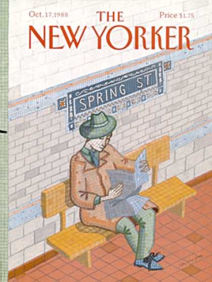
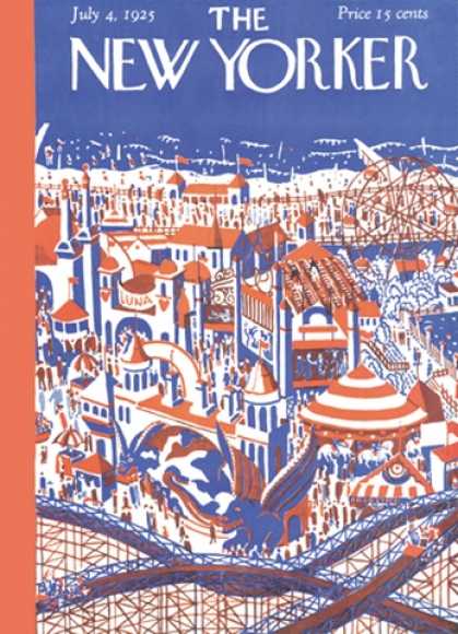
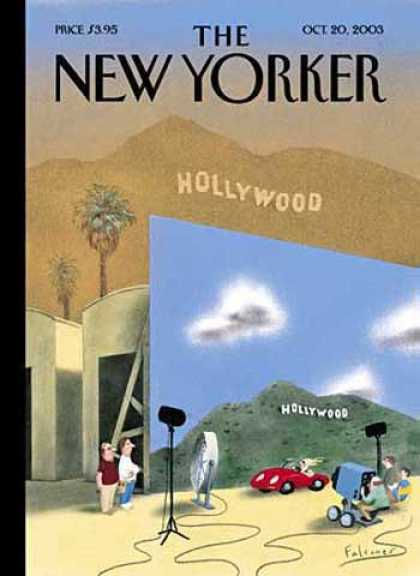
The New Yorker cover from July 4, 1925 disproves this article and argues quite a different view. This cover showed how technology could flow seamlessly into technology while still leaving the integrity of the place intact. Even though roller coasters and other new machines are shown as a major part of the place shown, you can still see people walking down the street with one another and it is very much still a public place. The 1988 cover also disproves the article because it shows how even with the presence of technology; people still immerse themselves into the place they are in. The image in this cover shows a person literally sinking in and becoming a part of the walls of New York City, while still clearly showing that he is using the subway. By making the subway a crucial part of the area and still having the person experience the place itself, this cover showed how technology could mesh with society without compromising its integrity. The New Yorker cover from October 20, 2003 supports Goldberger’s view that technology takes away a place’s unique quality by showing the difference between an actual well-known place and the picture that technology paints of it. This really showed how the ‘specialness’ of a place could be taken away by the grandeur of what technology could do.
While the 1930s and 1980s showed a lot of promise in regards to community and technology, the 2000s brought a lot of discontent and aversion towards it. The New Yorker covers from the 30s and 80s really showed how technology not only doesn’t hurt a culture, but it adds to the richness of experiencing it. The cover from the 2000s, however, shows how technology takes away from a place and the culture in it. Overall I think it is safe to say that all of the ill feelings towards technology, including those of Paul Goldberger and Disconnected Urbanism, generated fairly recently. Before the current times, technological advances were received in much better terms.

Wednesday, November 9, 2011

3 Cover choices

New Yorker 7New Yorker 3578New Yorker 3132


In the Disconnected Urbanism article, the author talks about how technology disrupts the sense of place we have when we are somewhere new. I think that the three New Yorker covers shown here show an interesting dynamic of how that mindset has evolved over the years. The first cover shown is from 1925 and is a very positive outlook on technology and community. Rather than disrupting a sense of place, the new technology of the amusement park is adding to the richness of the culture of the place itself. The way that the technology so effortlessly integrates with the community shows that the point of view of the artist is a polar opposite from that of the article. The second cover shown is also a positive outlook on technology because it also shows how technology becomes a part of the place itself. People immediately recognize this image as a subway station in New York City because it is an image that is signature to the place, therefore the technology of the subway itself is received in a positive way in regards to culture and community. The person himself in this picture is also becoming a part of the place by blending into the walls, which is exactly what the author of Disconnected Urbanism said should be happening. The final cover shown is where technology starts to be shown in a negative fashion. In this cover the technology is not becoming a part of the place, rather it is trying to change how people perceive it. The technology of special effects makes the actual place seem less grand in comparison, therefore when someone is in the actual place it loses its luster. This makes life seem more centered around the technological world than the real one. All in all, these three covers together illustrate people's changing view of technology, as well as how technology went from something that added to culture and a sense of place to something that takes away from it.

Tuesday, November 8, 2011

New Yorker covers 1925-2000s

New Yorker 7
New Yorker 266
This cover disproves the disconnected urbanism article because it shows how new technology adds to a community and its culture. Amusement parks and thrill rides were a new technology in the 20s when this cover was released, and is shown as something very exciting in this cover. Even with the presence of technology, this cover shows people walking down the street, and it portrays a rich culture.


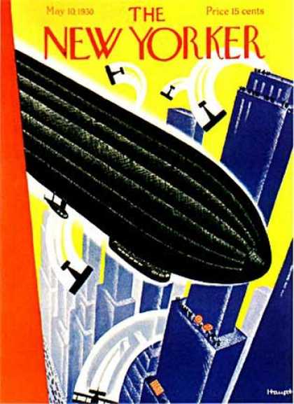
This cover shows a new technology that was very prevalent in the 30s, which was the zeppelin. I think that having the zeppelin shown in a large city positively portrays technology, because even though the zeppelin takes up a lot of space on the cover, older things like biplanes and communities on the streets are still shown.


New Yorker 3132This cover shows less of a positive view on technology, and focuses more on a loss of self. The subway was a breakthrough in technology, and this cover shows a man blending into the walls of the subway station. This gives a sense that the person isn't a person anymore, but is becoming technology.


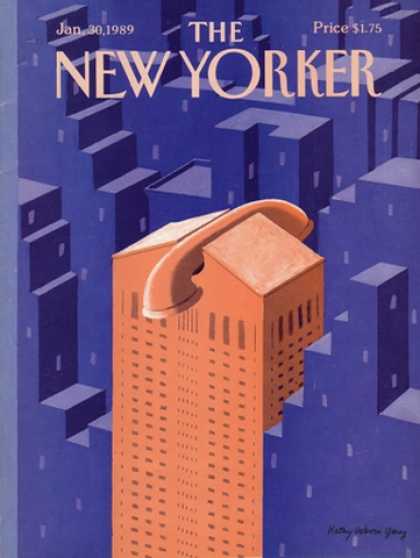
New Yorker 3145This cover is also a negative view of technology by saying that technology isn't just a piece of the city anymore, rather the city is becoming technologically dependent. By showing a building as a telephone the artist is clearly trying to say that phones are taking over city life.


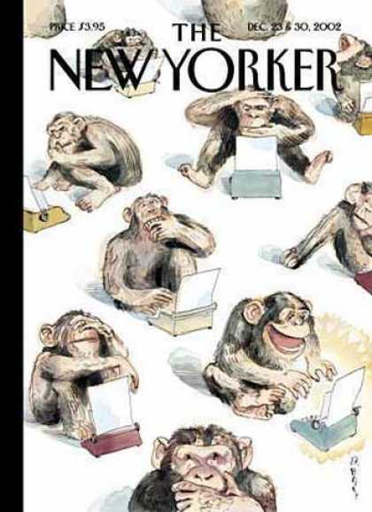
New Yorker 3555This cover is even more negative than the previous because it is making fun of humans who use technology. By insinuating that even a monkey could use these things, the artist is making technology seem less significant. This portrays the humans who use it as losing their humanity.


New Yorker 3578This final cover makes the argument that technology changes everything now, even if it is unnecessary. It also shows how using technology to enhance things makes the real world seem less great.

Sunday, November 6, 2011

Technology Articles

http://www.nytimes.com/2011/10/30/opinion/sunday/twitterology-a-new-science.html?_r=1&ref=socialnetworking

This article disproves the article we read in class because it talks about how things like twitter are opening up a whole new field of science. The article talks about how scientists and researchers use twitter to learn about cultures and language. It also makes the point that global moods can be more closely analyzed by what people post. This article definitely takes a more positive approach on technology by viewing it as a research tool, and a cultural melting pot.

http://www.nytimes.com/2011/10/23/arts/artsspecial/social-networking-among-young-arts-professionals.html?ref=socialnetworking

This article also disproves the disconnected urbanism article by talking about how technology brings people together as a community, rather than secluding ourselves. As the senior marketing manager at the Guggenheim says, “We use Twitter to not only to connect with one another, but to share what we feel brings value to a larger online arts community,”. This is a much more positive outlook on technology and culture together. This article also talks about how art majors can explore a much wider world of art right at their fingertips, which is much more than art majors in the past have been able to have.

Monday, October 31, 2011

Disconnected Urbanism Response/Summary

In the article “Disconnected Urbanism”, Paul Goldberger states his disagreement with technology on the basis that it homogenizes the world and makes traveling less ‘special’. Goldberger talks about how when someone is talking on the phone they are no longer at the place they are in, and they are really transported to a virtual world. He argues that technology makes public places more private, and gives the places less meaning. Goldberger also talks about how in the olden days people would have to send letters overseas in order to communicate and now people get upset when they have to fax something rather than e-mail. With everyone talking on cell phones, Goldberger says, we are experiencing a loss of culture.

I think there were a few things that Goldberger failed to touch on in this article. First of all, he did not mention how technology helps us to experience all cultures whenever we want in the blink of an eye. In my opinion, technology has done what many thought was impossible: The ability to be in a new place, while still experiencing your favorite parts of other places. I do agree with the fact that technology can interrupt tranquil moments and be a nuisance at times, but when used discreetly it allows people to experience a plethora of different things at once which I believe to be quite stimulating to society. I think that Goldberger focused in on the negative impacts of technology on culture (which of course there are many) and didn’t talk about the positives at all. Transporting to a virtual world may disconnect people for a moment, but the virtual world has so much culture on its own. While I agree that technology can be overused, I believe that it has allowed humans to explore culture even more in depth rather than compromising it.

Wednesday, October 26, 2011

FINAL DRAFT Paper #2

Michelle LaRosa

Paper#2

Dr. Devine


            In looking at the October cover of the New Yorker made by Erik Drooker, as well as his other covers/artworks, it is clear that he is making a statement about climbing the social ladder and being above New York City itself. On top of that, he is clearly highlighting the chaos and confusion of the city. This cover, as well as his other works, really describes the New Yorker as a magazine because it pinpoints the elitist nature of the New Yorker reader. Even looking at the advertisements for fancy cars and expensive watches on the inside of the magazine show how the New Yorker is trying to make people feel like they are above everything, which Erik Drooker really captures in his artwork.

            The cover has an overall blue color scheme to it. The only color that sticks out other than blue is a yellow glow that seems to come from the depths of the city. The blue parts indicate the tranquility and peacefulness of being above the city as opposed to the hot yellow glow of the chaos down below. I think Drooker chose to make it nighttime to further dictate peace, and show how the streets are bright even at night. The couple standing on top of the building is blue as well, and they are holding hands. This portrays peacefulness, romance, and happiness. In this artwork Drooker builds a contrast between peace and chaos, and he doesn’t necessarily portray the chaos as ‘bad’, but more as something to escape from time to time. Drooker insinuates through his art that by reading the New Yorker the reader will be temporarily at peace and free from the chaos, confusion, and hubbub of everyday life.

One of Drooker’s pieces of art that really struck me was called “The Maze”. It is similar to the October cover in that it is an aerial view of the city. It depicts New York City as a maze of interlocking buildings, and it shows a bird breaking free from it. I thought that was a great comparison to the New Yorker cover because the cover shows a similar image of a couple standing atop a building overlooking the city. Although “The Maze” has more of a theme of freedom and the New Yorker cover has a romantic theme, they both have the thought of breaking free from chaos. Another similar artwork I found by Drooker was a September cover he has created. The image shows yet another aerial view of the city with thousands of similar looking businessmen on stilts walking above the city. This, yet again, is a statement about being elitist/climbing a social ladder. Drooker really puts an emphasis on being above the city, which insinuates that the New Yorker reader is someone who desires to set him or herself apart from the chaos.

In all of Erik Drooker’s artworks and covers, he portrays the New Yorker reader as a normal average person who wishes to escape city life by means of art, culture, and feeling superior. The advertisements in this issue of the New Yorker are for items of luxury. For example, the back cover of the magazine is an advertisement for Breguet watches. The only boutiques advertised that carry these watches are on Madison Avenue and Beverly Hills, which are very expensive neighborhoods. This indicates that by having one of these watches, the reader will acquire status or class. This further proves the supposed elitist nature of the New Yorker reader. Another striking advertisement is one of a luxury car. One of the passages on this advertisement says ‘It’s not just luxury. It’s smarter than that.’ which signifies the New Yorker reader as even being above luxury itself. The tagline for this advertisement is ‘Nobody’s Fool’ which makes the reader feel intelligent by wanting a luxury car that is also fuel-efficient. The tagline grabs the reader by instantly making them feel like the car, as well as themselves, is a cut above the rest. All of these luxury advertisements, plus the statement made on the cover, are evidence that the New Yorker reader wants to feel elitist and superior while reading this magazine. Lastly, there is a political cartoon on the last page of the magazine that grabbed my attention. The cartoon shows a couple who have horse shaped lower bodies. The man is walking into their home out of the rain and says “Sorry I’m late. I had to give the boss a ride home.” This struck me as a funny allusion to the chaos of everyday life that most people deal with, such as sucking up to one’s boss. This depicts the chaos of city living, and allows the reader to reflect on it in a humorous fashion. By doing this, the New Yorker is not only acknowledging everyday life, but they are also making it seem beneath the reader in a sense.

By putting together the statement made by Drooker on the front cover with the advertisements and cartoons inside the magazine, this issue of the New Yorker clearly paints a picture of escaping from city life. Drooker doesn’t depict city life as wrong or bad, but more as something that people should take a break from. Not only this, but the New Yorker also makes the reader feel above it all and that they deserve status and luxury. This makes the New Yorker less of a magazine, and more of a world to pull the readers into that is less tumultuous than their actual lives.