Monday, November 14, 2011

Paper #3 Draft


Michelle LaRosa
Paper #3
Dr. Devine
Between the 20th and 21st centuries there is a distinct difference in how new technologies are viewed by the public. In the 20th century technology was seen as an innovative new way to add to the richness of culture, whereas in the 21st century technology seemingly destroys culture. By looking at three New Yorker covers from a wide range of time periods, it is easy to see the shift in opinion. The ‘sense of place’ that was talked about in the article “Disconnected Urbanism” is also represented in these three covers. In the 1930’s technology added to a place, but in modern times technology replaces it with something ‘better’. This shows how the more technology advances the more we experience a loss of society.
 In the article “Disconnected Urbanism”, Paul Goldberger makes it clear his disapproval of how technology has made places less special. He argues that technology has made it so “Even when you are in a place that retains its intensity, its specialness, and its ability to confer a defining context on your life, it doesn’t have the all-consuming effect these places used to.” Goldberger believes that a place should have a special effect on a person when they’re there, and that technology such as cell phones takes away from that. Another issue Goldberger addresses is the fact that technological advancements have caused a cultural loss. He thinks that walking down a street or being in a public place should be “all of us—different people who lead different lives—coming together in the urban mixing chamber.” Goldberger believes that by allowing technology to take such a prevalent role in our lives, we are sacrificing something much greater.
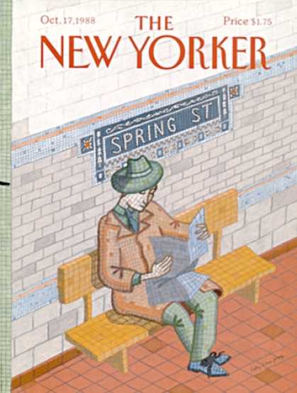
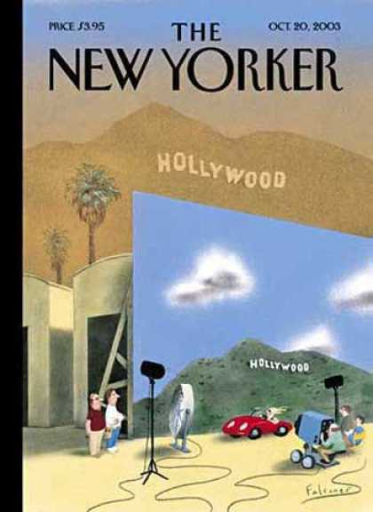
The New Yorker cover from July 4, 1925 disproves this article and argues quite a different view. This cover showed how technology could flow seamlessly into technology while still leaving the integrity of the place intact. Even though roller coasters and other new machines are shown as a major part of the place shown, you can still see people walking down the street with one another and it is very much still a public place. The 1988 cover also disproves the article because it shows how even with the presence of technology; people still immerse themselves into the place they are in. The image in this cover shows a person literally sinking in and becoming a part of the walls of New York City, while still clearly showing that he is using the subway. By making the subway a crucial part of the area and still having the person experience the place itself, this cover showed how technology could mesh with society without compromising its integrity. The New Yorker cover from October 20, 2003 supports Goldberger’s view that technology takes away a place’s unique quality by showing the difference between an actual well-known place and the picture that technology paints of it. This really showed how the ‘specialness’ of a place could be taken away by the grandeur of what technology could do.
While the 1930s and 1980s showed a lot of promise in regards to community and technology, the 2000s brought a lot of discontent and aversion towards it. The New Yorker covers from the 30s and 80s really showed how technology not only doesn’t hurt a culture, but it adds to the richness of experiencing it. The cover from the 2000s, however, shows how technology takes away from a place and the culture in it. Overall I think it is safe to say that all of the ill feelings towards technology, including those of Paul Goldberger and Disconnected Urbanism, generated fairly recently. Before the current times, technological advances were received in much better terms.

Wednesday, November 9, 2011

3 Cover choices

New Yorker 7New Yorker 3578New Yorker 3132


In the Disconnected Urbanism article, the author talks about how technology disrupts the sense of place we have when we are somewhere new. I think that the three New Yorker covers shown here show an interesting dynamic of how that mindset has evolved over the years. The first cover shown is from 1925 and is a very positive outlook on technology and community. Rather than disrupting a sense of place, the new technology of the amusement park is adding to the richness of the culture of the place itself. The way that the technology so effortlessly integrates with the community shows that the point of view of the artist is a polar opposite from that of the article. The second cover shown is also a positive outlook on technology because it also shows how technology becomes a part of the place itself. People immediately recognize this image as a subway station in New York City because it is an image that is signature to the place, therefore the technology of the subway itself is received in a positive way in regards to culture and community. The person himself in this picture is also becoming a part of the place by blending into the walls, which is exactly what the author of Disconnected Urbanism said should be happening. The final cover shown is where technology starts to be shown in a negative fashion. In this cover the technology is not becoming a part of the place, rather it is trying to change how people perceive it. The technology of special effects makes the actual place seem less grand in comparison, therefore when someone is in the actual place it loses its luster. This makes life seem more centered around the technological world than the real one. All in all, these three covers together illustrate people's changing view of technology, as well as how technology went from something that added to culture and a sense of place to something that takes away from it.

Tuesday, November 8, 2011

New Yorker covers 1925-2000s

New Yorker 7
New Yorker 266
This cover disproves the disconnected urbanism article because it shows how new technology adds to a community and its culture. Amusement parks and thrill rides were a new technology in the 20s when this cover was released, and is shown as something very exciting in this cover. Even with the presence of technology, this cover shows people walking down the street, and it portrays a rich culture.


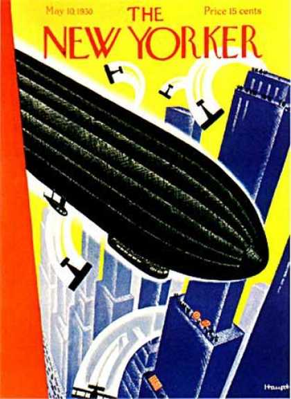
This cover shows a new technology that was very prevalent in the 30s, which was the zeppelin. I think that having the zeppelin shown in a large city positively portrays technology, because even though the zeppelin takes up a lot of space on the cover, older things like biplanes and communities on the streets are still shown.


New Yorker 3132This cover shows less of a positive view on technology, and focuses more on a loss of self. The subway was a breakthrough in technology, and this cover shows a man blending into the walls of the subway station. This gives a sense that the person isn't a person anymore, but is becoming technology.


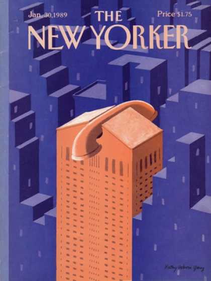
New Yorker 3145This cover is also a negative view of technology by saying that technology isn't just a piece of the city anymore, rather the city is becoming technologically dependent. By showing a building as a telephone the artist is clearly trying to say that phones are taking over city life.


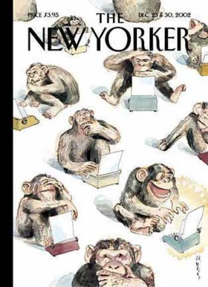
New Yorker 3555This cover is even more negative than the previous because it is making fun of humans who use technology. By insinuating that even a monkey could use these things, the artist is making technology seem less significant. This portrays the humans who use it as losing their humanity.


New Yorker 3578This final cover makes the argument that technology changes everything now, even if it is unnecessary. It also shows how using technology to enhance things makes the real world seem less great.

Sunday, November 6, 2011

Technology Articles

http://www.nytimes.com/2011/10/30/opinion/sunday/twitterology-a-new-science.html?_r=1&ref=socialnetworking

This article disproves the article we read in class because it talks about how things like twitter are opening up a whole new field of science. The article talks about how scientists and researchers use twitter to learn about cultures and language. It also makes the point that global moods can be more closely analyzed by what people post. This article definitely takes a more positive approach on technology by viewing it as a research tool, and a cultural melting pot.

http://www.nytimes.com/2011/10/23/arts/artsspecial/social-networking-among-young-arts-professionals.html?ref=socialnetworking

This article also disproves the disconnected urbanism article by talking about how technology brings people together as a community, rather than secluding ourselves. As the senior marketing manager at the Guggenheim says, “We use Twitter to not only to connect with one another, but to share what we feel brings value to a larger online arts community,”. This is a much more positive outlook on technology and culture together. This article also talks about how art majors can explore a much wider world of art right at their fingertips, which is much more than art majors in the past have been able to have.